OVERVIEW: Our design team was challenged with making the drone fleet management system more intuitive and useful for its users. After interviews, competitive analysis, and usability testing, we decided to surface the items that were most important to our users.
SOLUTIONS:
• Create more intuitive navigation.
• Improving flight and mission planning process.
• Providing an easier way to monitor flights and missions.
• Making it easier to create, manage and report the required documentation.
• Surfacing the most important information on the dashboard, allowing users to keep track of the required tasks and meetings.
• Designing a mobile application flow for better in-filed experience.
TIMELINE: 3 weeks.
TEAM: PJ Valenzuela, Liani Ware, Tissiana Alves.
MY ROLE: User interviews, Journey Maps, Sketches, Rapid Ideation, High Fidelity Wireframes, InVision Prototype for desktop.
DELIVERABLES: High Fidelity Wireframes, Interactive Prototypes for Desktop and Mobile, Style Guide.
TOOLS: Sketch, InVision, Treejack by Optimal Workshop, Trello.
Background
Aerial Vehicle Safety Solutions Inc. (AVSS) focuses on advancement of unmanned aerial vehicle (UAV) safety and the reliable integration of them into commercial operations. One of their current projects is the development of the fleet management software. The Command Centre Software is a scalable solution for fleet managers that lead a team of pilots in various geographic locations.
Therefore the system:
• Should handle any level of activity with teams of any size and an unlimited fleet size.
• Allow a fleet manager to ensure pilots are performing tasks safely for clients.
Key features
Redesigning navigation to increase the accessibility of content
One of the problems we have identified through usability testing and heuristic evaluation was confusing information architecture. Our users had difficulty finding the necessary information and navigating the current system. So we redesigned the information architecture and navigation.
Improving the planning experience
To improve an experience of planning a mission we designed:
• A separate window to plan a mission, where you can map the location, enter the dates, the objective and choose the type of the mission for better filtering experience later.
• One place to plan a flight, where one can search for the aircraft and other equipment, map the flight and add waypoints, assign a pilot and an observer, include the required checklists and other documentation.
Incorporating checklists and making required documentation more accessible
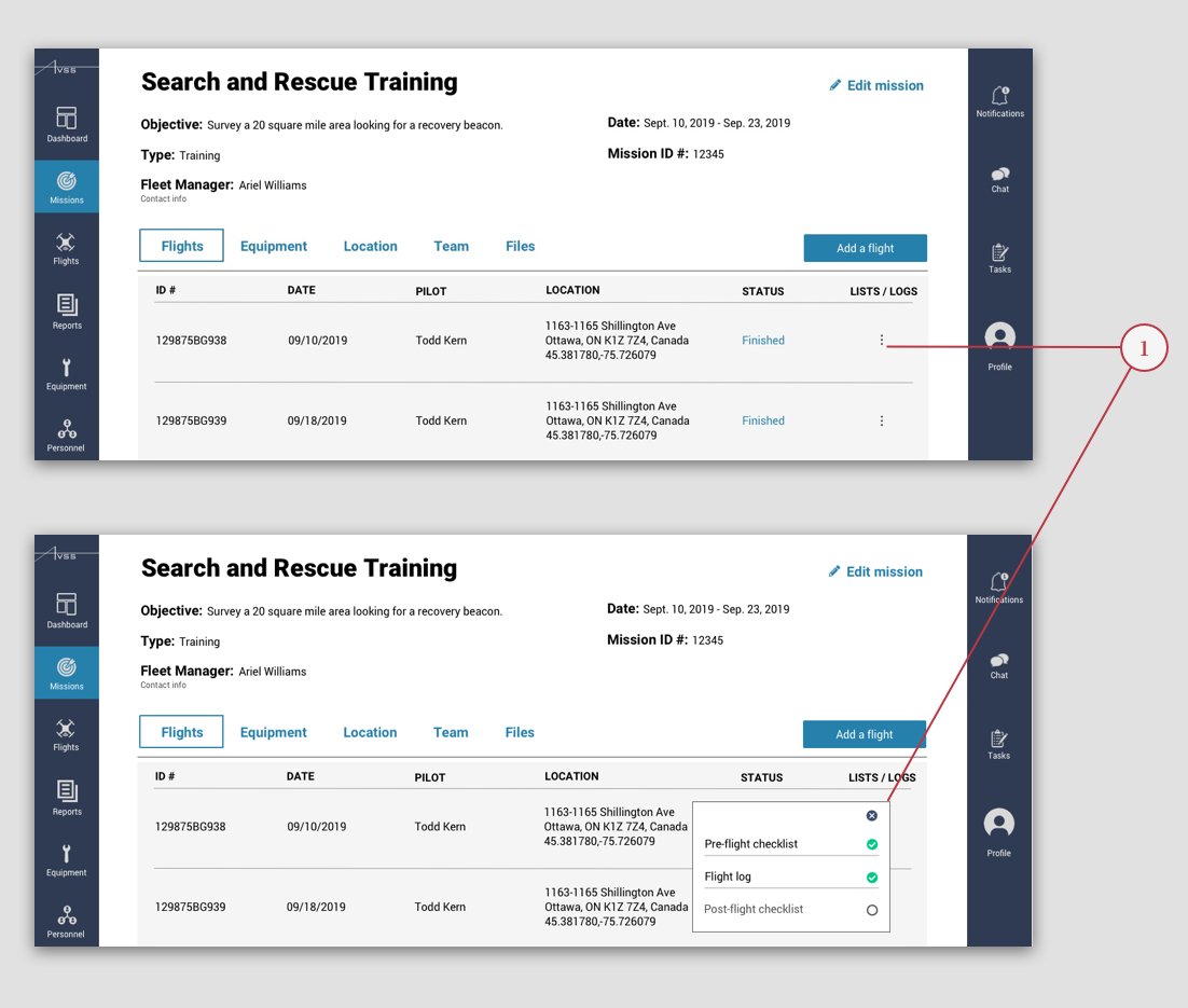
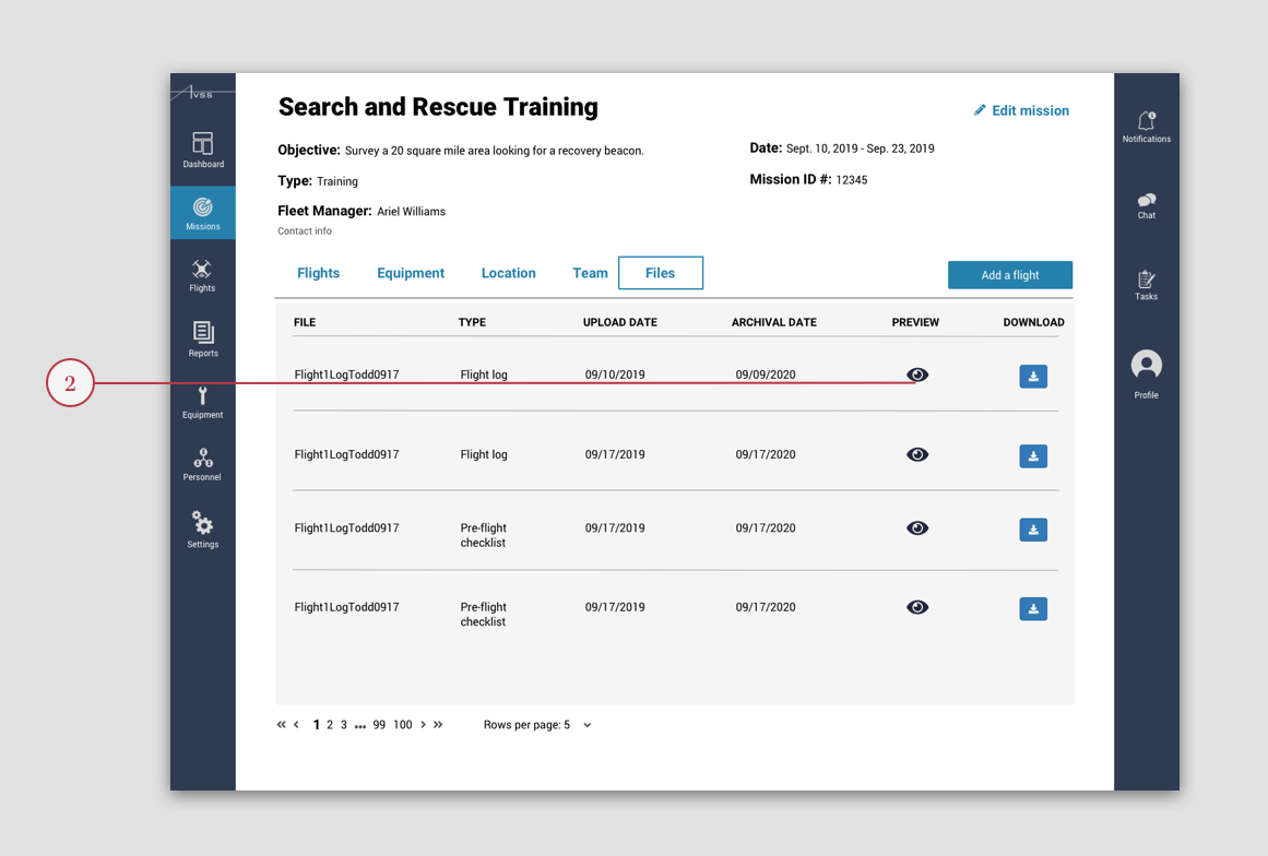
Because checklists were important for both of our users, we provided multiple ways to access the content.
• One can access the checklist directly from the list of flights on the mission detail page.
• One can also preview and download a checklist from the "Files" tab on the mission detail page.
How we got here
Discovering the problem
When we received access to the current system and started talking to our client, the challenges became immediately obvious. Our users could not effectively use the system because the system was confusing and the experience frustrating. To identify more specific areas for improvement, we dived into research:
• interviewed drone pilots (View Interview Protocol)
• gathered feedback from our client
• conducted usability testing of the platform (View Usability Testing Protocol)
• completed heuristic evaluations of the current platform
• conducted competitive analysis
• combed through the commercial drone pilot forum
All of those different pieces of data informed the decisions we made during our redesign and helped us understand our users.
Identifying the most frustrating parts of the experience
To help us better understand our users experience, I created journey maps for a fleet manager and a drone pilot. That helped us better visualize the pain points. We realized that fleet managers and pilots struggled to find relevant information when they needed it the most loosing time they needed to successfully plan and manage their missions.
“Mission planning should be handled with safety and efficiency at the forefront. Reactions to events should be planned well ahead of the flight through proper mission planning protocols and revision of proper emergency S.O.P’s relevant to the mission parameters and environment.”
- UAV pilot
Opportunities for improvement
We used "how might we" technique to help us focus on the most important areas for improvement so we asked ourselves:
• How might we improve the planning experience for both a drone pilot and a fleet manager?
• How might we make the reporting process easier for our users?
Creating more intuitive navigation
We redesigned the information architecture of the platform to make navigation more intuitive for the users. Our research revealed the core features important for fleet managers and pilots. We further identified the categories for the navigation by conducting a card sort activity. Starting with an open card sort within the team we validated our decisions by asking people outside of our team to perform a closed card sort. I had an idea to further test our navigation using Treejack by Optimal Workshop, the software for the information architecture validation. So I created a clickable version of the sitemap and asked the participants to complete three tasks. The results showed that participants mostly went for the page we intended them to hit. Finalizing our information architecture redesign, we created a site map.
Narrowing down the scope with MV
We knew we couldn't design everything we would like in three weeks. So we had to prioritize the features based on the pain points our users experienced. We have previously identified the opportunities on how we might improve users experience based on the journey maps. Now we used the insight we gained to narrow the scope of our project.
Desktop Features
• See the current and recent missions on the map
• Plan a new mission (determine mission objective, date, location)
• Plan new flights (add them to the mission, determine date, location, equipment, pilot, observer and requirements)
• See the details of the mission
• See all the relevant checklists and flight logs
Mobile Features
• Chat with the team and manager
• View and complete required checklists
• Livestream the flight for the manager to monitor
• Upload the flight log
Sketching ideas
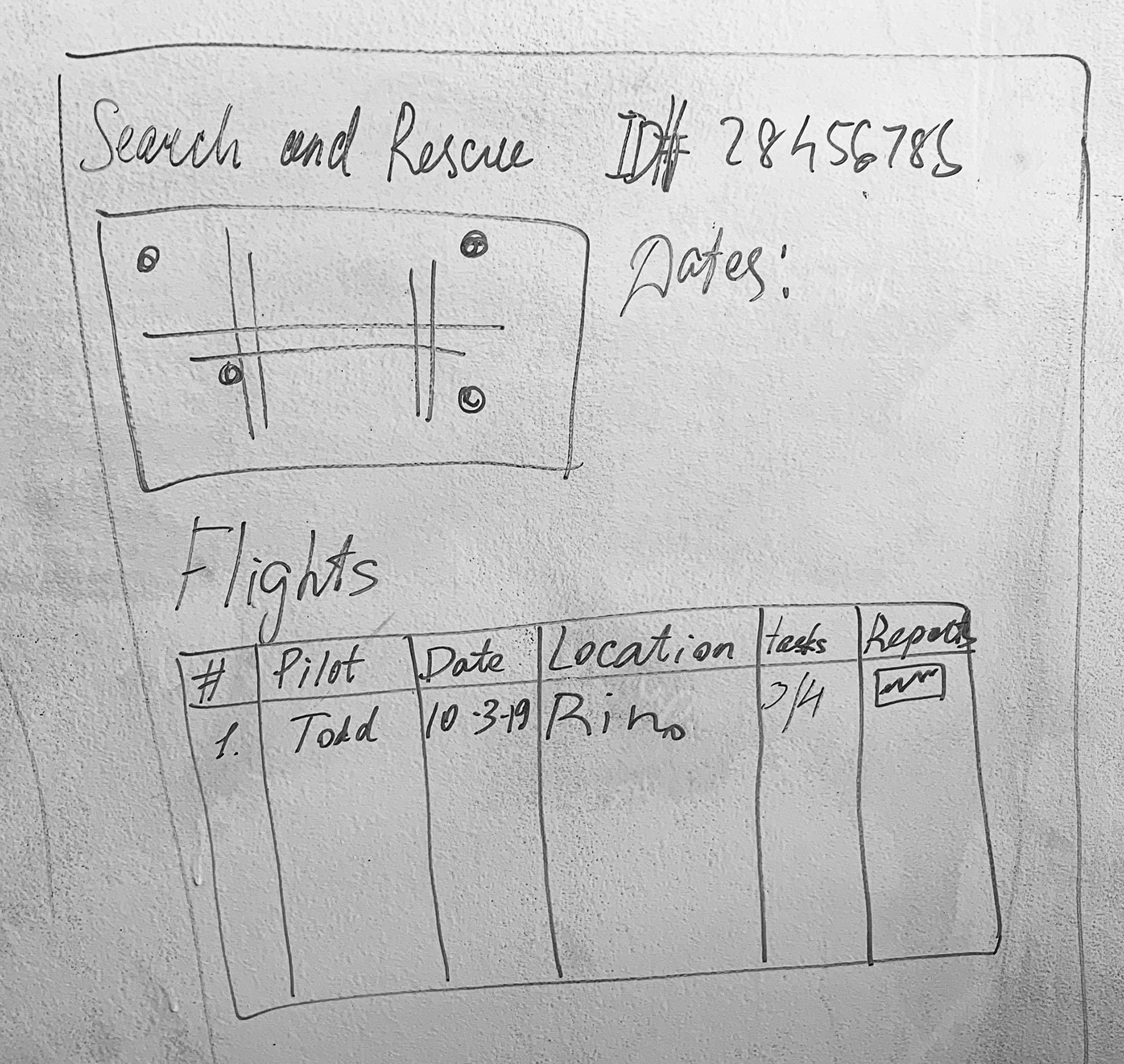
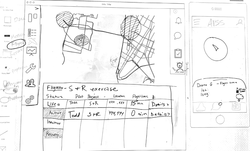
We immersed ourselves in sketching different versions of the platform ranging from spreadsheet-like tables to customizable components-based designs. We had several rounds of ideation. One - focusing primarily on navigation. Another - to create layouts.
Testing and iterating
We started with detailed sketches on the whiteboard and then created low-fidelity wireframes in Sketch. I then took some of the low-fidelity wireframes my teammates made, combined our ideas and raised the fidelity. We evaluated our designs for usability, visual design, and effectiveness. We made changes based on what we learned. It was obvious users, especially non-experts in the field, had a difficulty finding the pre-flight checklists. People looked for it in two different places with equal frequency. So we made sure our users could find the checklists in both places. After a few tweaks, individuals were able to find the pre-flight checklist.
Future development
• Test the platform with the users of the platform - UAV pilots and fleet managers inside AVSS
• Refine the Dashboard design.
• Think through every interaction a user can have on each screen and design various states for those interactions.
• Incorporate filters to improve search results.
• Incorporate ways to make the desktop platform customizable.
• Design more user flows and more screens.
