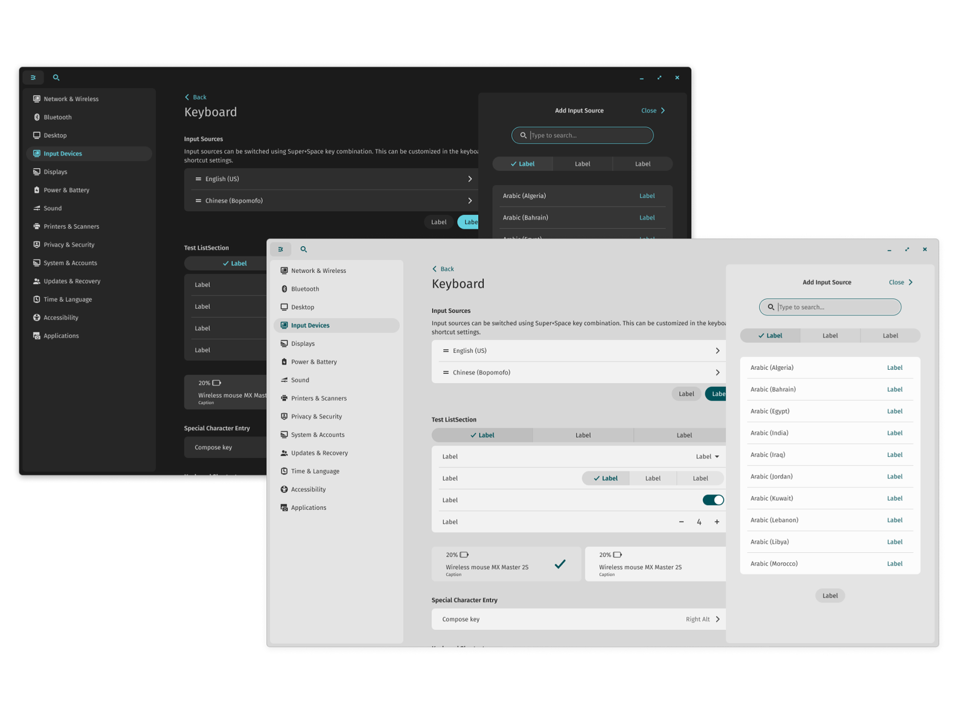
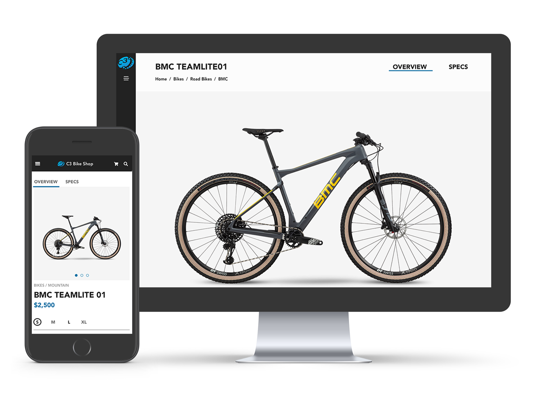
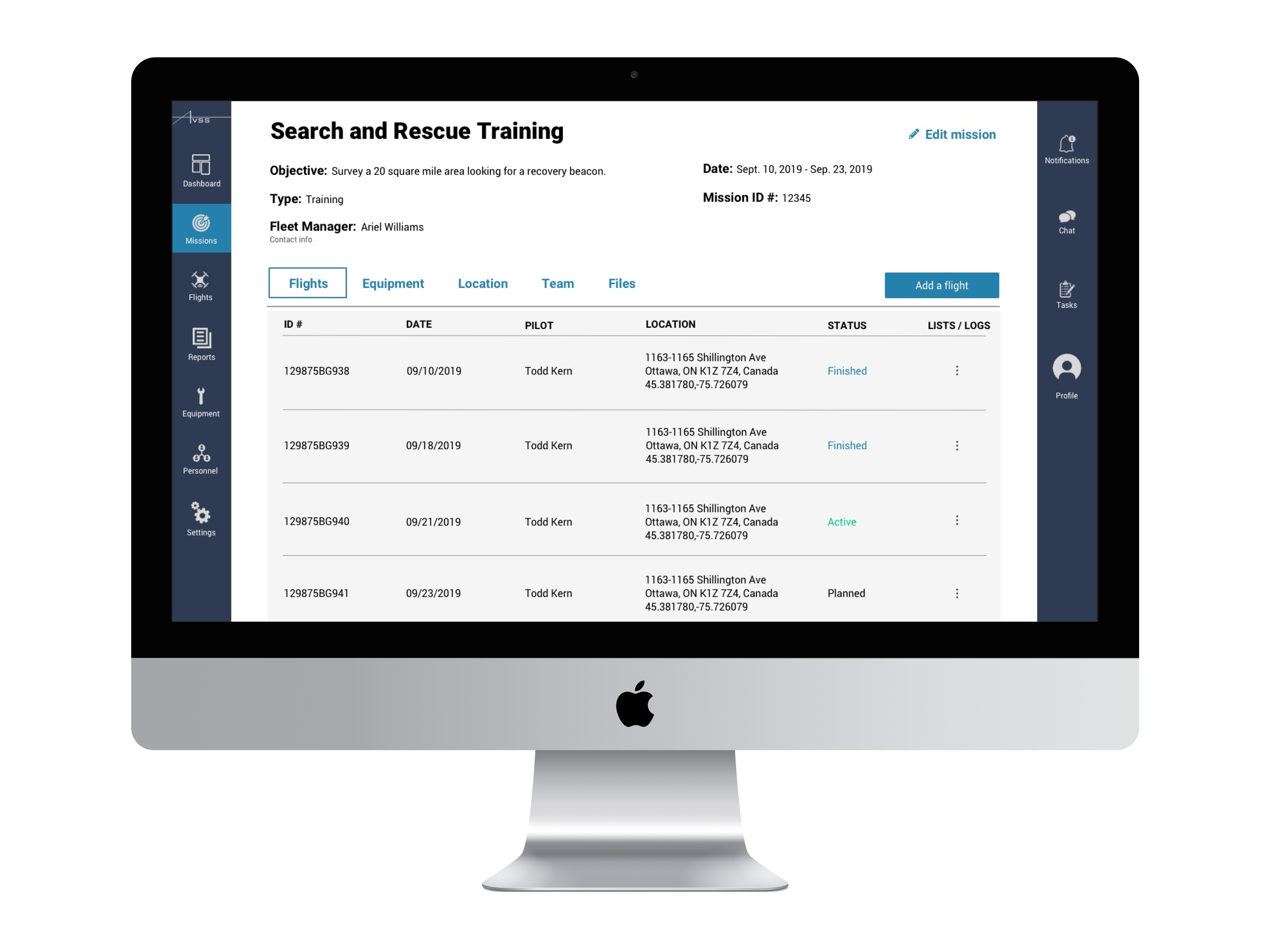
This is a collection of design experiments where I have tried to explore different patterns and layouts. Sometimes I kept the designs purely functional, sometimes I got more playful with colors and shapes.
Sign Up page
These two screens are for the app about recycling old things. I first decided for myself what the app is going to be - tips on recycling old things. Then identified the essential components of a sign up form - name, email and a sign up button. I the sketched on paper the layout of the screens. Color palette and typography came next. Lastly, I animated this small interaction using Principle.
Error Page
This is an error page for the vacation booking website. I first sketched the general layout on paper, then decided on the text that should be included. After refining the typography, I came back to the shapes and colors.
Music Player
These two screens are for the music player. The first one shows different playlists and what they include. The music playing now is shown at the bottom of the screen. If you swipe up, the screen changes and you can see a player view for the current composition.
Weather App
In this case, I tried to design a weather app focusing primarily on the functionality. I included information that is essential for the users.
Credit Card Checkout
I have started designing this screen by deciding on the essential information to include on the page: name on the credit card, card number, expiration date, security code and the confirmation button. I later added the payment method selection and the order summary to improve the process for the users. There is also an indication that this is the last step in the process under the "Payment" heading.
Mortgage Calculator
I have designed this screen following Material design guidelines. As in all of the other designs I, first, determined the information that was helpful to include. Then I decided on using cards to group the information and make it easier for the user to extract. And after that I designed each card according to the guidelines.
User Profile
I made it in two color schemes. The idea was to create a user profile for the art lover app. The app would provide a way for people to follow news, events and discussions about art topics. It will also allow to create personalized collections. The art theme allowed me to play with shapes to make the app more friendly and playful. Maybe just a little too playful, hmm?


