Summary: Building a themeable design system from the ground up to maintain consistency across different projects and provide cohesive but personalized user experience to our audience.
Primary users: All users of the desktop environment who would enjoy customizing appearance, designers and developers.
Role: Lead UX Designer, Design System Management and Documentation, Accessibility Design.
Duration: March 2022 - present
Tools: Figma, Variables.
Platforms: COSMIC desktop environment, Iced toolkit
Problem
Currently, System76 has their own Linux distribution, Pop!_OS, which is based on GNOME desktop environment. But a couple years ago the company decided to develop their own desktop environment, COSMIC. With the development of the new system came the need for a consistent approach that would keep designers and developers on the same page. The new desktop environment should be adaptable to other brands while providing a cohesive and recognizable experience for all users.
Theming of the desktop environment has a long history in the open-source Linux community. It fuels creativity among people and has the potential to transform everyday experience into something more memorable and expressive. There is also a long history of struggle to enable such creativity without compromising the coherence of the system experience, different aspects of usability, and the brand identity of the system. Therefore one of our objectives early on was to provide an easy and meaningful way to personalize the desktop’s appearance. It was important for us to follow one of the main principles of COSMIC desktop environment and to build customization into its foundation. That led to a conclusion that the design system should be themeable.
How might we ensure quality and consistency across various parts of the system?
How might we increase productivity for designer and developer collaboration?
How might we give our audience enough creative freedom without overwhelming complexity?
How might we give our audience creative freedom without compromising usability?
Solution
Themeable design system that includes a set of standards, patterns and components flexible to stylistic changes.
Process and key decisions
Building a themeable design system from ground up is a complex process that consisted of multiple smaller projects. We went through several stages starting with brainstorming for the main layout patterns we wanted to use and outlining the foundations for the design system. We then went through the series of projects working on designing the components in context of their usage. Circling back to the starting point we then revisited what we have created so far to ensure consistency and making the necessary adjustments to the system as a whole.
Initial iteration and brainstorming
During the initial stage, we outlined foundational basics focusing on the layout, typography, and color. We already had a brand typeface but no fully developed typography scale specific to the operating system. So I created one. Through a series of ideation sessions we also brainstormed possible ground rules for how the color should function in the UI and what should be the common UI elements.
Mockups for one of the initial concepts with some of the customized colors.
Building component library
We then proceeded to the next stage growing the body of designs, building more components, testing and validating the concepts we outlined. Because most of the components could only be tested in context of their use we selected one system application as our main design playground combined with forays into the initial design for other applications to help us refine some of the concepts. Namely, Settings application. We’ve identified the information architecture tree, prioritized panels for the MVP and focused on each one as a separate project. Each of those projects followed a base process:
• Research existing Settings design using current Pop!_OS release and analyzing competitors.
• Define the existing problems.
• Ideate solutions for the identified problems while making sure to include the important functionality that was already working well, and using this as an opportunity to design components for the design system.
• Conduct usability testing with one or a few Settings panels to test the new designs.
• Iterate.
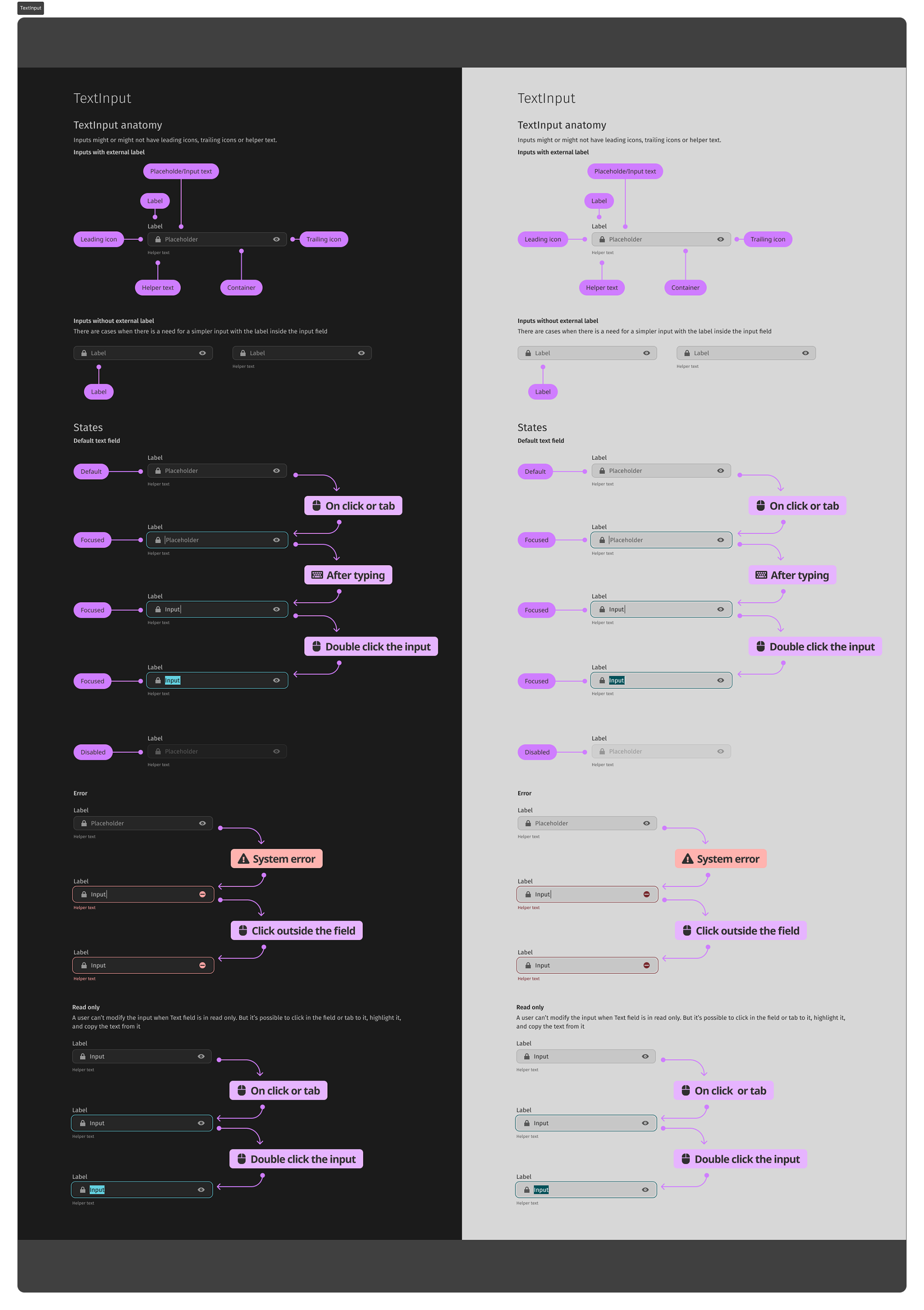
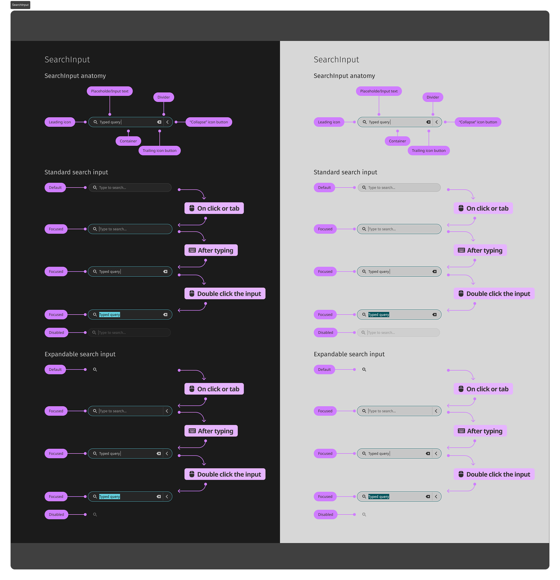
Documentation for each component provides details about component anatomy, different component variables or styles, examples of the expected interactive states and respective input that triggers them including tabs, keyboard input, single and double clicks. Every component also has the information about the spacing, corner radii and sizing variables.
Revisions, testing and redefining some of the rules
As we went through the iterative cycles we’ve expanded the design system more and more but we’ve inevitably accumulated some discrepancies as well. Therefore I went through a series of revisions for the design system as a whole ensuring consistency throughout the system in the way components were created, how they followed the foundations, and how they could be themed. It coincided with Figma releasing the new changes for the DevMode and variables so I took this as an opportunity to increase consistency in the system, finalize some of the earlier concepts and improve the designer to developer hand off process.
Theming through Automatic Color generation
When we first set on the journey to create COSMIC design, I started by analyzing what has been done by other systems and desktop environments. It quickly became apparent that incorporating theming into the design system was based on avoiding hard-coding specific values for colors, typography and other design elements. Design tokens were used to allow better consistency within various branches of the design system.
As I’ve started to experiment with the first layout and component patterns that our team produced during the initial workshops and sprints, I quickly realized we needed to automatically generate colors for theming. While most operating systems only allow users to select an accent color from the predetermined set and choose light or dark mode, there was a strong desire in the company to enable people to have more creative freedom related to system appearance. At the same time, too many choices can result in decision fatigue leading to an unpleasant and overwhelming experience. Therefore, our challenge was to reach some balance in the number of customization options.
Ground rules and principles
To figure out the rules for the dynamic color system, we have first determined what elements of the UI should be customizable and what elements should be derived. During the initial iteration we primarily focused on surfaces, text and dividers.
We knew that we wanted to follow flat design as it was embedded into the brand identity of Pop!_OS and System76. So the best way to convey elevation in the surfaces was with the color - by lightening it wherever possible since lighter objects are perceived as being closer. Considering the relationship between various surfaces in the first set of patterns and components we ended up with the system of two main surfaces and two child surfaces respectively.
Initial concepts regarding color relationship of various UI elements.
Once we set the ground rules for the surface containers, we decided to tie text, dividers and borders to their respective surfaces as well. In order to provide more customization options, we decided that while it should be possible to generate all surface colors based on the lowest surface it should also be possible to further change each of the main two surfaces. That’s why text, dividers and borders were conceptualized as belonging to the respective surface. It is important that those elements pass the necessary requirements for color contrast so automatically generating those based on the surface seemed the best way to ensure accessibility.
How to generate colors
We’ve considered and tested multiple ways of deriving the color for those elements: automatic palette generation using specific tokens associated with tone value found in Material3 design system, overlays of neutral color like black and white with different percentage of opacity to convey elevation, using specific ranges of the contrast ratio. We finally settled on using steps in lightness value. So the basic process involves converting sRGB colors to OKLCH color space, manipulating Lightness value of the color while keeping hue and chroma values the same, then converting the resulting color back to sRGB.
We chose OKLCH because it uses perceived lightness and therefore has more predictable results for color modification, palette generation and therefore for accessibility. It is similar to LCH color space in this regard but unlike the latter doesn’t have an unexpected hue shift on chroma and lightness changes in blue colors.
What's Next
We're currently working on implementation for the Appearance panel of the Settings application. Once this panel is implemented, we'll be able to extensively test changing appearance internally trying to figure out how well the rules work. This is a safe playground where we can rapidly refine the design and implementation before we have an external alpha release.
Other things we're currently working on include:
• Three different styles for the corner radii of various components.
• Compact and spacious spacing styles.
• Usability testing for the Appearance panel settings.
