OVERVIEW: Create a responsive e-commerce website that caters to the needs of customers from both communities providing a high quality personalized experience.
SOLUTIONS:
• create more space for visuals
• provide customized experience
• capitalize on existing strengths
• save user's time
TIMELINE: 3 weeks.
TEAM: Individual Project.
MY ROLE: User interviews, User Personas, Sketches, Rapid Ideation, Responsive Design, Low to High Fidelity Wireframes, InVision Prototype for desktop.
DELIVERABLES: High Fidelity Wireframes, Interactive Prototypes for Desktop and Mobile, Style Guide.
TOOLS: Sketch, InVision, Zeplin.
GOAL: Create a responsive e-commerce website that caters to the needs of customers from both communities providing a high quality personalized experience.
Business and its challenges
Colorado Cycling Connection, C3 Bike Shop, is a locally owned and operated bike store in Denver. They make it their mission to focus on community needs and therefore carry highly customized selection of products. I have talked to the sales representatives and did online research to identify their challenges in the era of large e-commerce retailers:
• They have two locations, one in the heart of an urban community close to Downtown, another in Golden near the mountains. Each community has its own needs influencing the inventory of the stores.
• Both locations have competitors in close proximity that have websites with e-commerce.
• Large part of their revenue comes from service and repairs instead of the bike sales making business dependent on the season.
When I needed a new bike my husband and I walked to several local shops to learn what they had in stock. I am a shorter person and had a difficult time trying to find the right size bike. After wasting a lot of time, we have finally found the perfect one at the C3 Bike Shop. The shop employees did everything to tune the bike for me. But what if we would have no time to walk to all the shops in the area? The store's website doesn’t provide the information about the available bikes so we would probably turn to a larger e-commerce retailer instead. That made me think what I can do to help.
To help guide my UI choices I conducted a competitive analysis and researched other bike stores and bike manufacturers to see what they display, how they categorize the bikes, how they filter, and if they offer customized experience. Most of the websites were split into two groups.
Community stores offered variety of products and services but had a somewhat cluttered information architecture.
Specialized stores had a strong brand, customized experience and clear structure but their website organization wouldn’t work for the community store.
I found it challenging to strike the balance between the two. I truly believed that manufacturer websites did a much better job of showcasing the product and providing customized experience. But they had a freedom to focus on one type of product while community bike shops had to cater to a variety of needs.
Users and their needs
In the beginning of the project I tried to find as much information as I could about existing and potential customers. What were their needs, goals and difficulties? I interviewed 7 people who own a bike. My goal was to understand why people needed a bike, how they used it, how they approached shopping for one and what were their challenges.
To guide my design decisions I identified common themes through affinity mapping, synthesizing my data from user interviews, store conversation, and online reviews. Consolidating the insights, I developed two user personas. I used these personas to keep my process focused on the needs, expectations and difficulties of the real customers.
In addition, I learned that customers had three major reasons to choose the local store: knowledge, customization and community. Even people who didn’t buy their bikes at the store expressed a wish to shop locally in the future. So keeping in mind everything I learned, I brainstormed for the opportunities.
• How might I enable customers to access all the relevant information?
• How might I help customers save their time?
• How might I better build a customers trust through the e-commerce website? Building trust would help users save time that they will otherwise need to spend researching the information.
Design decisions
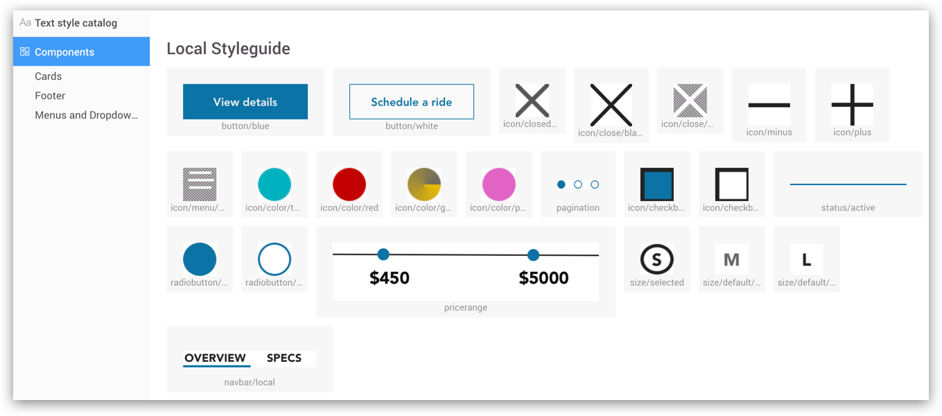
Creating a design system
I had only two weeks to design medium fidelity wireframes. Having such a short time to create a working prototype was challenging but it helped me stay focused on the needs of my users. I had to limit myself to design only an e-commerce shop for bikes leaving other sections for future development.
I spent another week raising the fidelity of my prototypes. Along with the hi-fidelity wireframes, I produced Sketch and Zeplin files documenting all elements to keep the designs as consistent and re-usable as possible.

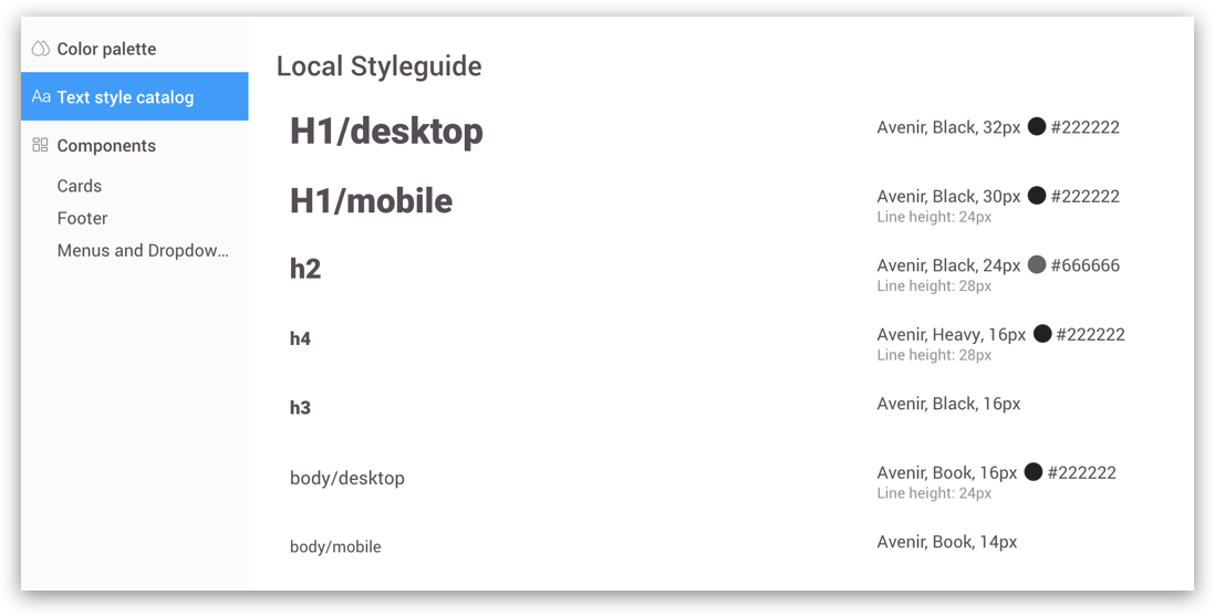
Create more space for visuals
I decided to use a vertical navigation bar instead of the horizontal one and to include a larger image of a bike on the home page for the following reasons:
1. Smaller bike images make it difficult to see the details of the bike. The screen-size image allows users to instantly get the feel of the store and gain trust in the quality of products and services.
2. Vertical navigation bar that folds as you start scrolling creates more space for the visual information and reinforces the impression.
Incorporate customized experience
1. I added a customization feature for the users like Shannon who didn't have much knowledge about bikes. A short survey about her needs would help generate a list of bikes that might fit her.
2. Originally I sketched the button “Can we help you find the right bike?” on the home page. But I realized that my other user wouldn't like that button in the middle of the screen. Simon already knew what type of bike he wanted and the button in the middle of the screen would seem intrusive to him. I could use that space more efficiently.
Capitalize on existing strengths
1. The current shop website has an option to schedule demo rides. “Bike Demo’s” item in the global navigation directs users to the page where they can see a few models of mountain bikes. Further clicking opens a contact form that a customer can fill to schedule a test ride.
2. Because a lot of users expressed a desire to test ride the bike before buying one I included the button “Demo” on the product listing page and on the product detail page.
“Demoed a full suspension from here for a day. I’m in the market for a new bike but wanted to try one out before making the commitment”
- Yelp review
3. While conducting user tests I learned that it was confusing. It was not clear if clicking on the button would open a demo video or a demo description. Some users haven't even thought about scheduling a test ride so I changed the wording to “Schedule a test ride”.
Saving user's time
1. I have changed the checkout form from 5 initial screens to 2. Clicking through five screens created an impression of a longer checkout. So in order to simplify the checkout process I have decreased the number of clicks required.
2. I have moved the recommendations of similar products from the order confirmation page to the product detail page. User tests made it obvious that people were not likely to keep buying after they placed the order. Recommendations on the product detail page would provide an opportunity to compare different bikes. Mobile first approach helped me refine my components.
From low fidelity to high fidelity
FUTURE ITERATIONS
• Refining the list of questions for the survey to better assess the needs of the user.
• Develop information architecture for the "gear" section of the store. I did an open card sort to help define the categories for this section but it is currently the plan for the future.
• Develop a user flow to schedule a ride.
• Consider a way to incorporate demo videos or demo descriptions to help experienced cyclists access the information.
• Consider incorporating events (like community rides) in the community section to better engage with Shannon ("cycling is a community thing for me").
• Consider finding more ways to benefit from the store's experts.
